To mark their 75th anniversary, the Ottawa Valley Spinners’ and Weavers Guild invited members to participate in the creation of a communal tapestry. I’m relatively new to the Guild, but they are very welcoming and encouraging to new folks still in the process of learning their craft, so I signed up for a block.
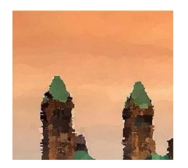
Participants were free to create their piece of the tapestry in any medium involving fibre, and I’m very curious to see how it comes out. This is the original image that was divided into 24 blocks. Each block is 6 inches by 6.5 inches.
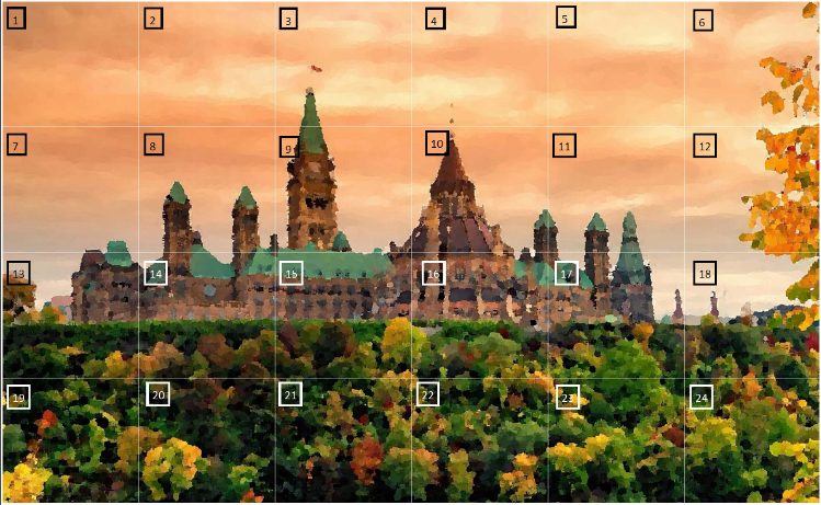
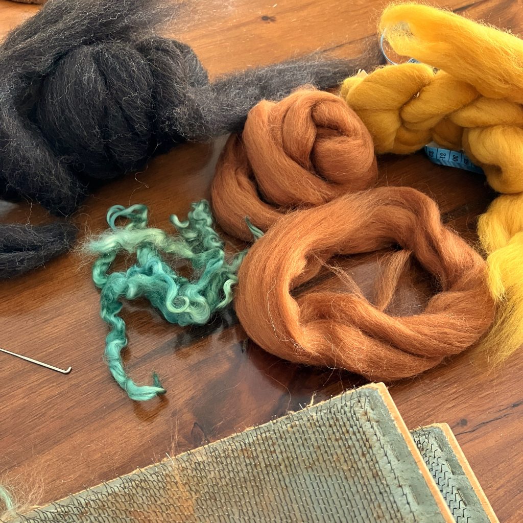
My piece is block #8, including some sky and some of the East Block towers. I was originally going to needle-felt the whole design, but in a fit of enthusiasm I thought I’d try wet-felting a background. I had some colours I thought might blend to make that lovely coral-coloured sky rather well.
In even more heights of hubris, I only thought to make a block somewhat larger than I needed. In retrospect, since felting a sheet 6″ x 6.5″ is just as much work as felting one 12″ x 13″ or twice as large again, I should have probably done that. But, one learns!
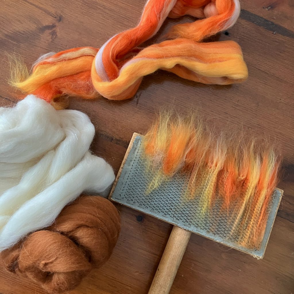
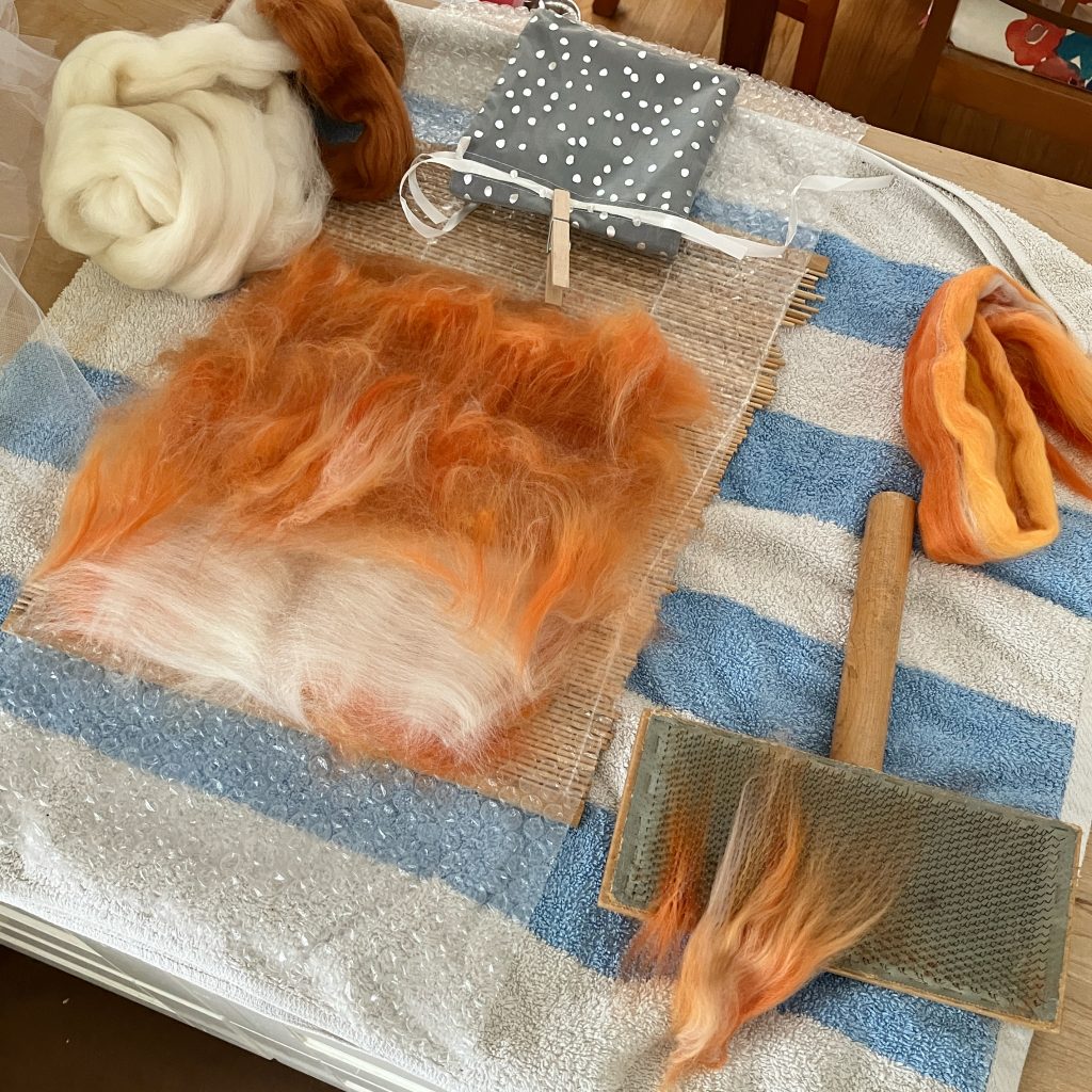
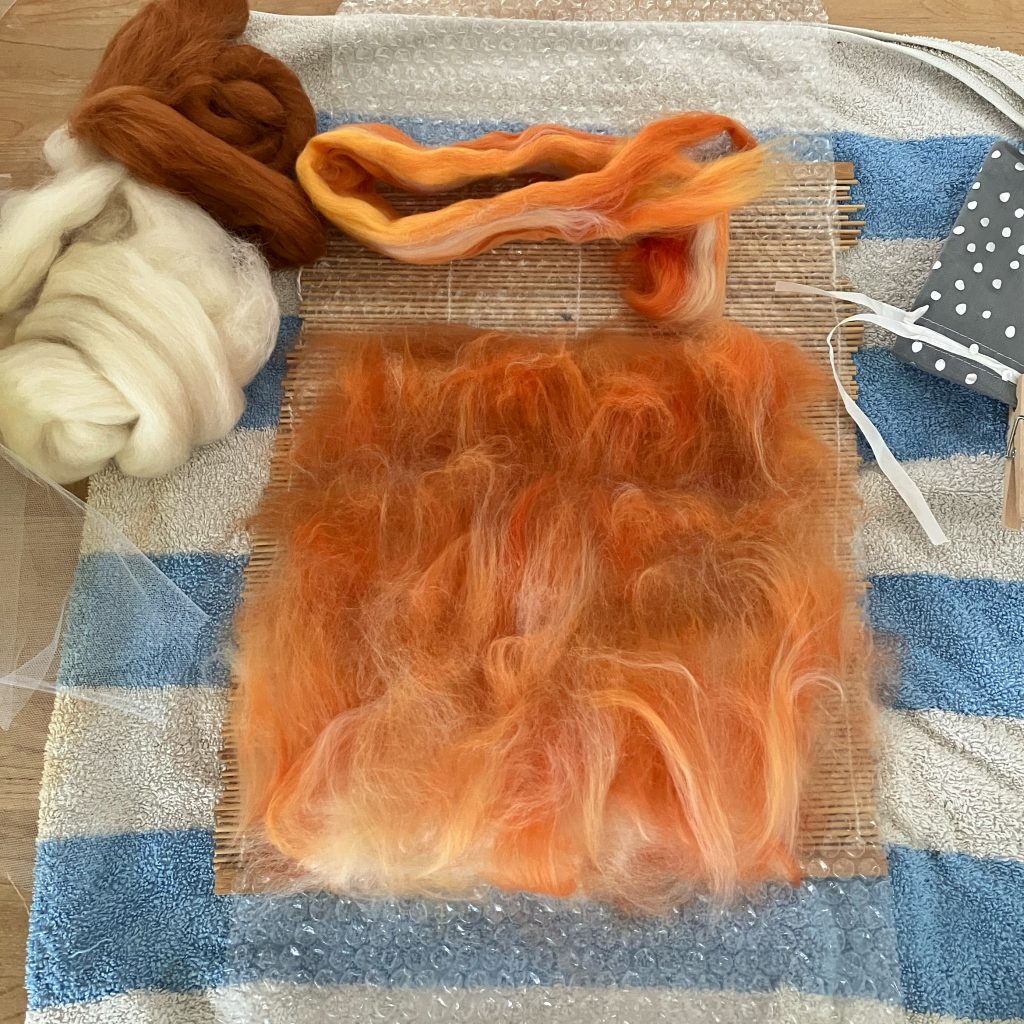
Speaking of learning, the art of blending colours for wet felting (and needle felting, for that matter) is one I am really enjoying. I thought the commercially blended merino roving I had was a bit dark, and a bit yellow, so I blended in a layer of cream and a few wisps of the caramel colour to make the sky have the same gradients as in the source image.
The felting was easy. I came reasonably close to the desired size, and decided to cut it very slightly larger then felt it a tiny bit more to heal the raw edges.
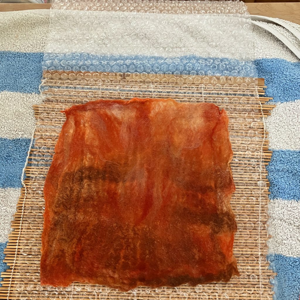
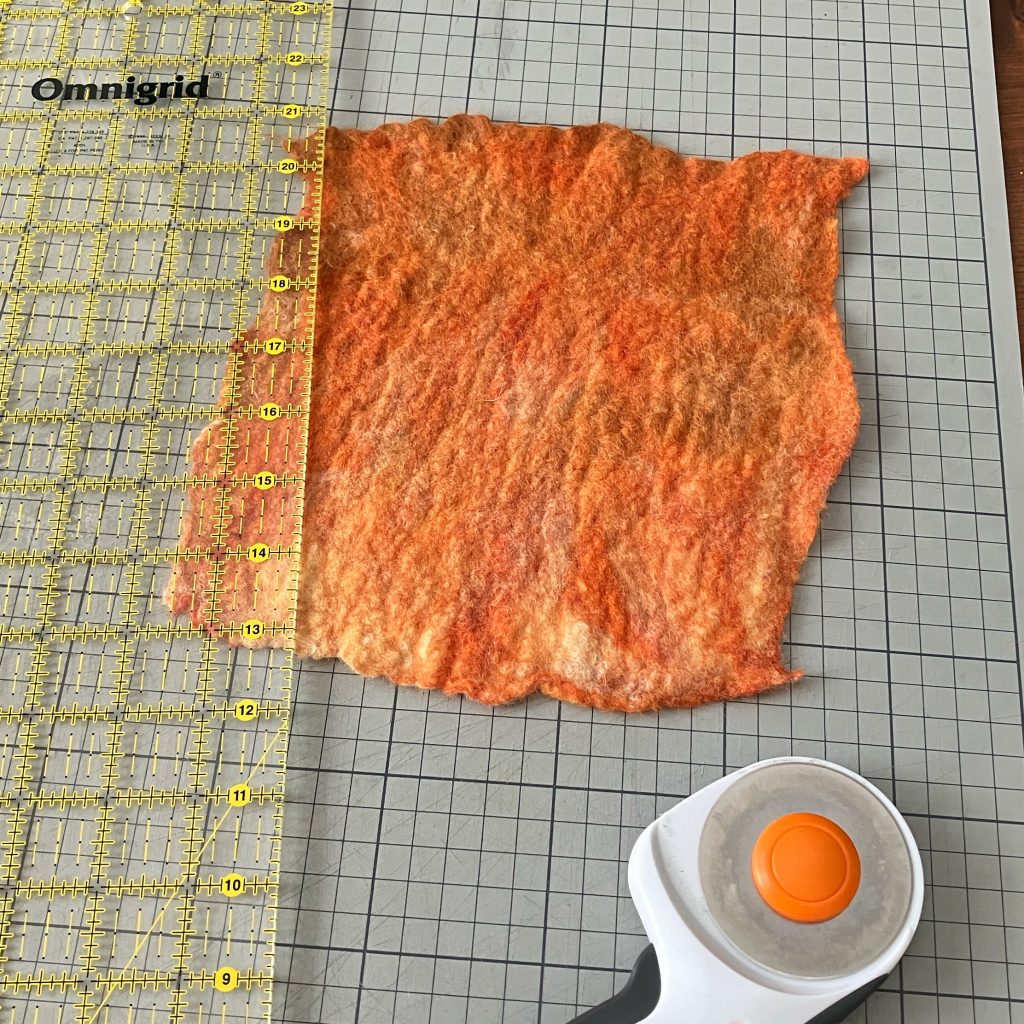
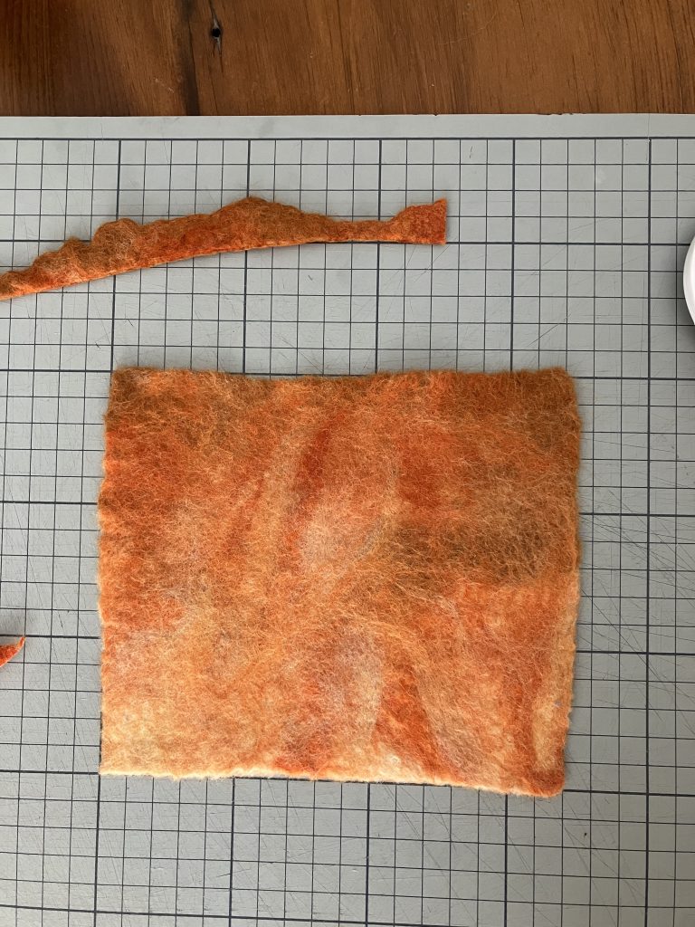
Of course it shrank ever so slightly more than it should have, and so I tugged this way and that, learning that when you stretch horizontally, you lose a smidge vertically, so when you tug that back into shape, you lose the ground you gained horizontally. Eventually I got it close enough. That was one afternoon’s work.
The next phase was to needle-felt the foreground design of the buildings. I was quite stressed about that, knowing that they had to line up perfectly with whatever the owner of block #14 was creating. I noodled various thoughts around tracing and grids, and eventually came up with an idea I was rather pleased with. I overlaid a grid on the original image of my block (or more accurately, had my husband Mark do it with Adobe Illustrator) and then created the same grid on my felt block using pins and embroidery floss. There’s a special joy in creating solutions to problems using stuff you have just lying about – like your husband.
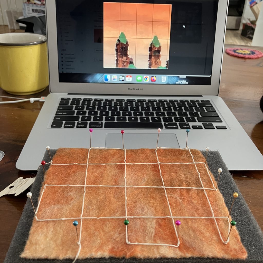
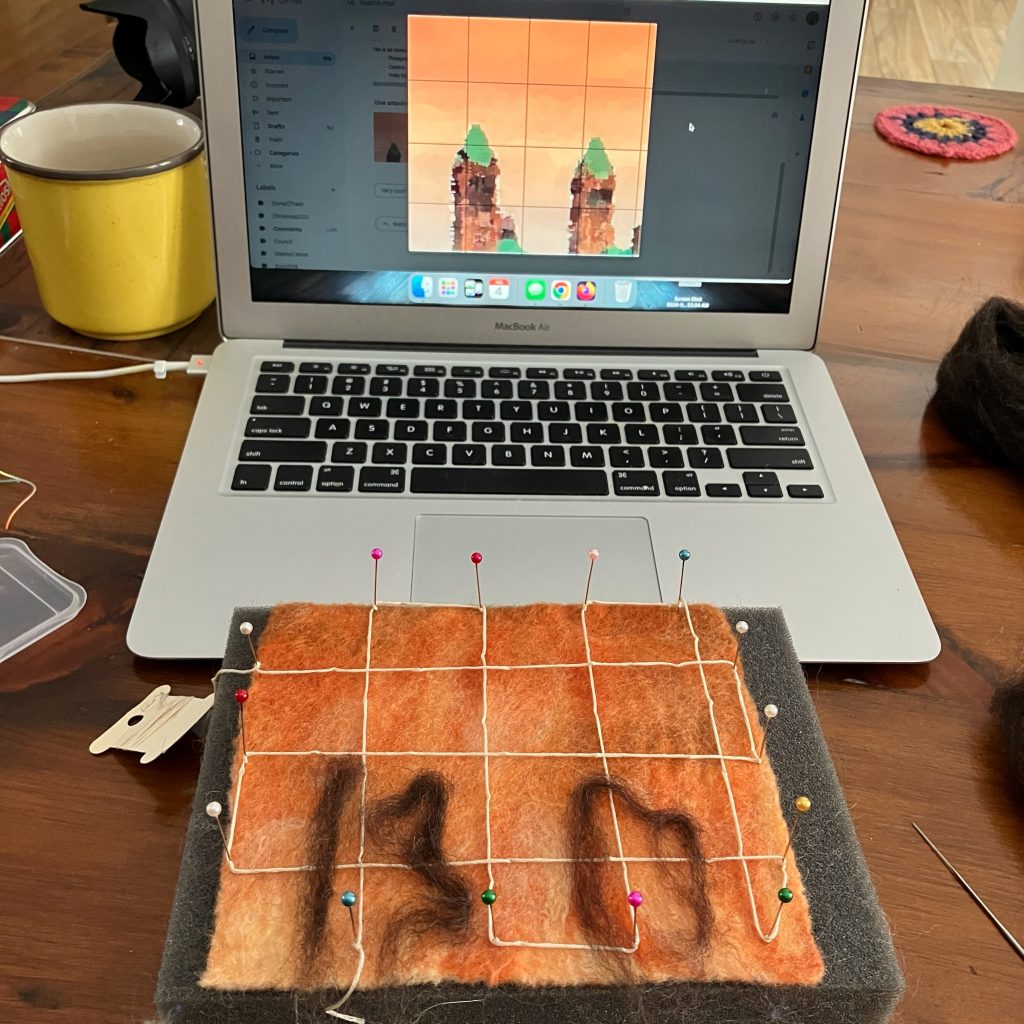
Once I had the outline of where I wanted the towers to be, I removed the embroidery floss grid lines but left the pins in place for reference and needle-felted the design in place.
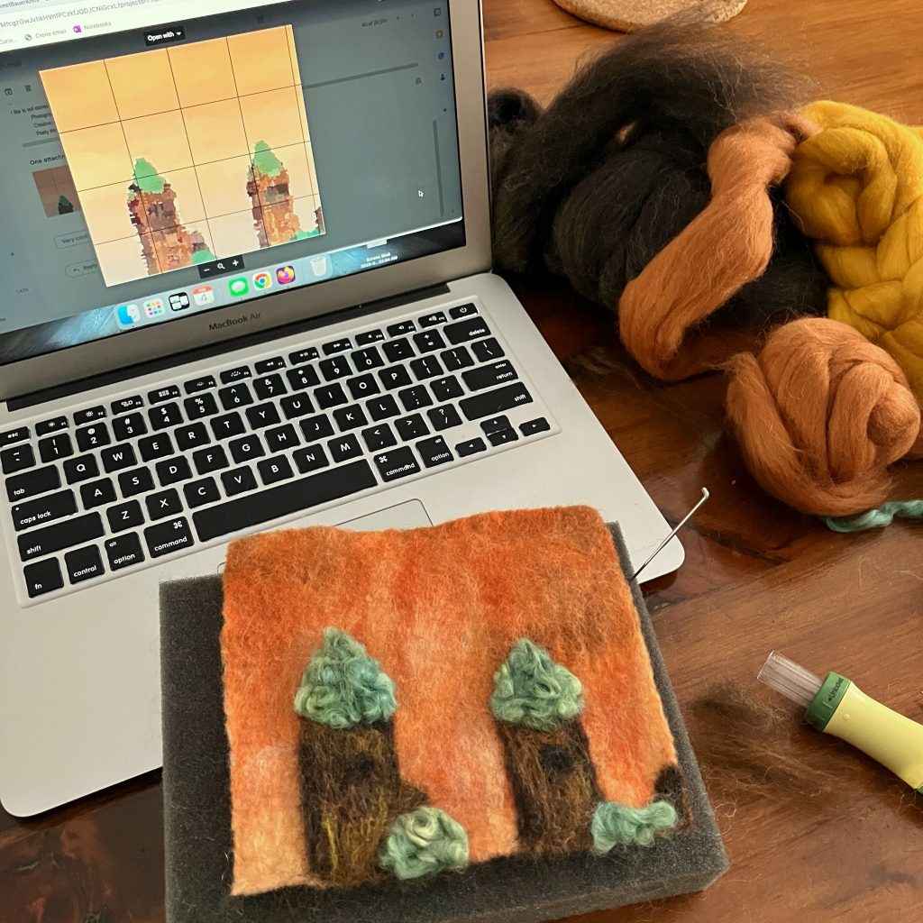
I was pleased to find the bright teal locks in my stash, as I think the iconic copper patina of the roofs is one of the most important parts of the image. At first I was going to comb them out, but I realized the curliness of the locks is itself rather iconic to felt work, so I worked with it instead of against it. I feared at first they looked more like trees than towers, but I think they came through in the end.
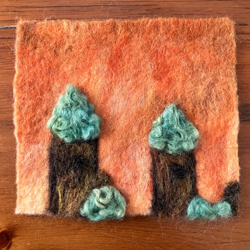
I’m pleased with how it came out, largely because it could have been so much worse. I think it’s a folky interpretation of an image that already has meandered quite a way into stylized representation of the original. Resisting a literal interpretation is something I’m very much struggling with in felting – it’s not photography, I keep reminding myself.
Having seen a preview of some of the other contributions, I’m quite humbled to have been included. I can’t wait to see them all come together!
